Creating Charts in the BI Module
Now that reports have been created in the BI Module, users might want to see the data represented in a visual format to review information quickly.
- To begin, select a report by either double clicking the report or select the menu in the right corner and click "Edit" to edit the report.

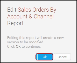
- A pop-up will appear informing the user that a draft report will be created that can be edited, this allows the user to experiment with fields, formatting, etc without overwriting the original report. Note: If you click save and activate the draft, it will over-write the original unless you save the report under a different name.
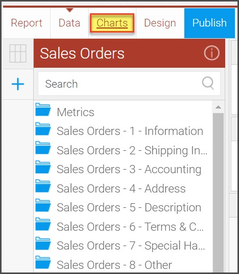
- Click on the Charts link to begin.
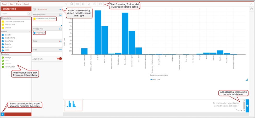
- You will see the report columns on the left menu panel, select the fields you want to review and add them to the Horizontal and Vertical Axis.
- Once selected, you now have a visual representation of the report data.
- By default, the system selects the best chart type for you based on the data you have selected.
- You can customize the charts by selecting the Auto Chart drop-down and click the "Select Chart Type" option for a list of available chart formats. Click on any of the charts to change the look of your data. The Chart Formatting Toolbar provides further editing options as well.
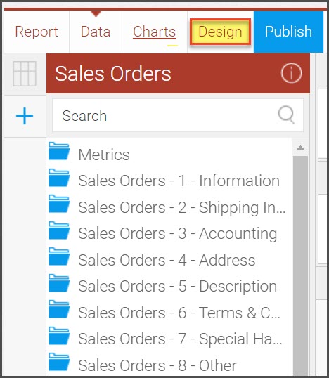
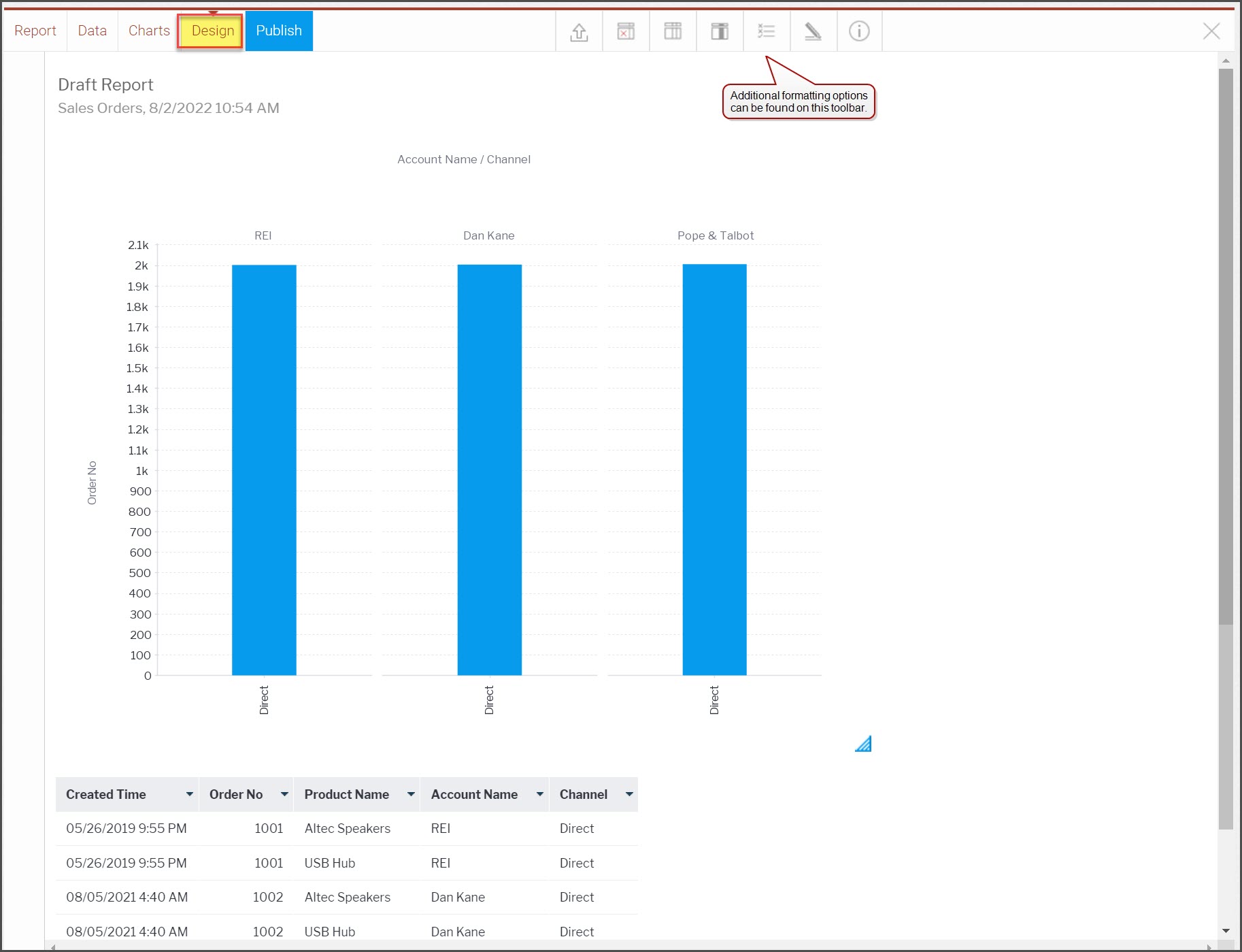
- You can combine the tabular data with the chart data into one view by clicking on the Design link.
- The results are displayed as shown below. This display can be further enhanced with additional formatting using the formatting toolbar.
- To save the report, click Report on the top left corner and click "Save". You have the option to save the report with a different name or if you leave all fields as they were previously then the report will update/overwrite the existing report.
Updated over 1 year ago
